Milk Tea App
Timeline
April - July 2022Role
UI/UX DesignerTools
Figma and Material DesignFeatured
DesignRush's Best App DesignsMy First-Ever Case Study
After completing my thesis, I found researching and discovering design solutions fascinating. Hence, I initiated the first step in pursuing it as a career by building my first exploratory case study. I took some Google UX Design Certificate courses to guide me through the process.
On the second course of the certificate, Sharpen, a brief generator, determined my brief:
“Design a food order customization app for a cafe”
Since the term cafe was quite vague, I chose to focus on milk tea cafes as I prefer them.
Problem
Now that I have a brief, I can start the exploratory research by learning about customers' experiences when ordering and customizing their milk tea. I chose one-on-one structured interviews as my data collection method to get in-depth insights from each participant.
My target participants for the interview were the following:
- 15-39 years old
- A resident of any city in the Philippines
- Has ordered from a milk tea cafe that customizes orders
I chose participants ages 15-39 because, according to Shakey's Pizza Asia Ventures Inc., the milk tea market in the Philippines is around those ages (Cabuenas, 2020). Moreover, I limited my study to the Philippines as I want my research to focus on Filipinos' experiences when ordering and customizing milk tea.
After interviewing my five target participants, I rewatched the interviews while taking notes on their answers. Upon reviewing my notes, I grouped the recurring responses and formulated my problem statement:
“Some people visit their favorite milk tea cafe to satisfy their sweet tooth or to destress. However, they feel pressured while ordering and customizing their milk tea because of the other customers waiting behind.”
User Persona

Anya, 22
Accountancy Student
Dumaguete City, PH
User Journey
Anya craved something sweet while studying. Hence, she traveled to the nearest milk tea cafe. Once Anya arrived to order, she felt overwhelmed by the selection of milk tea flavors and customizations, which made her take a while to decide on an order. Moreover, she felt pressured when more customers were arriving.
Goals
- To satisfy her sweet tooth
- To complete her tasks quickly
Frustrations
- Overwhelmed by the flavors and customizations of a milk tea order
- Pressured to order fast due to arriving customers
Solution

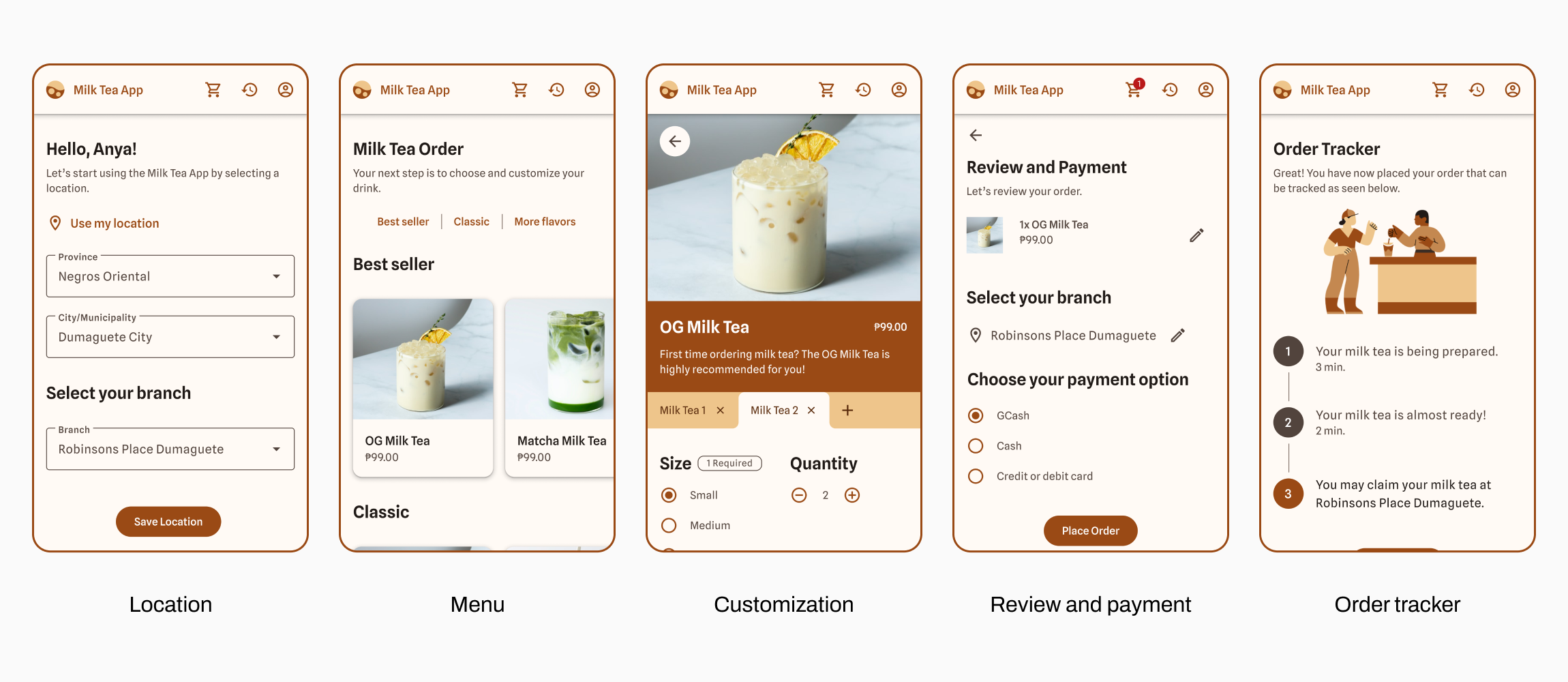
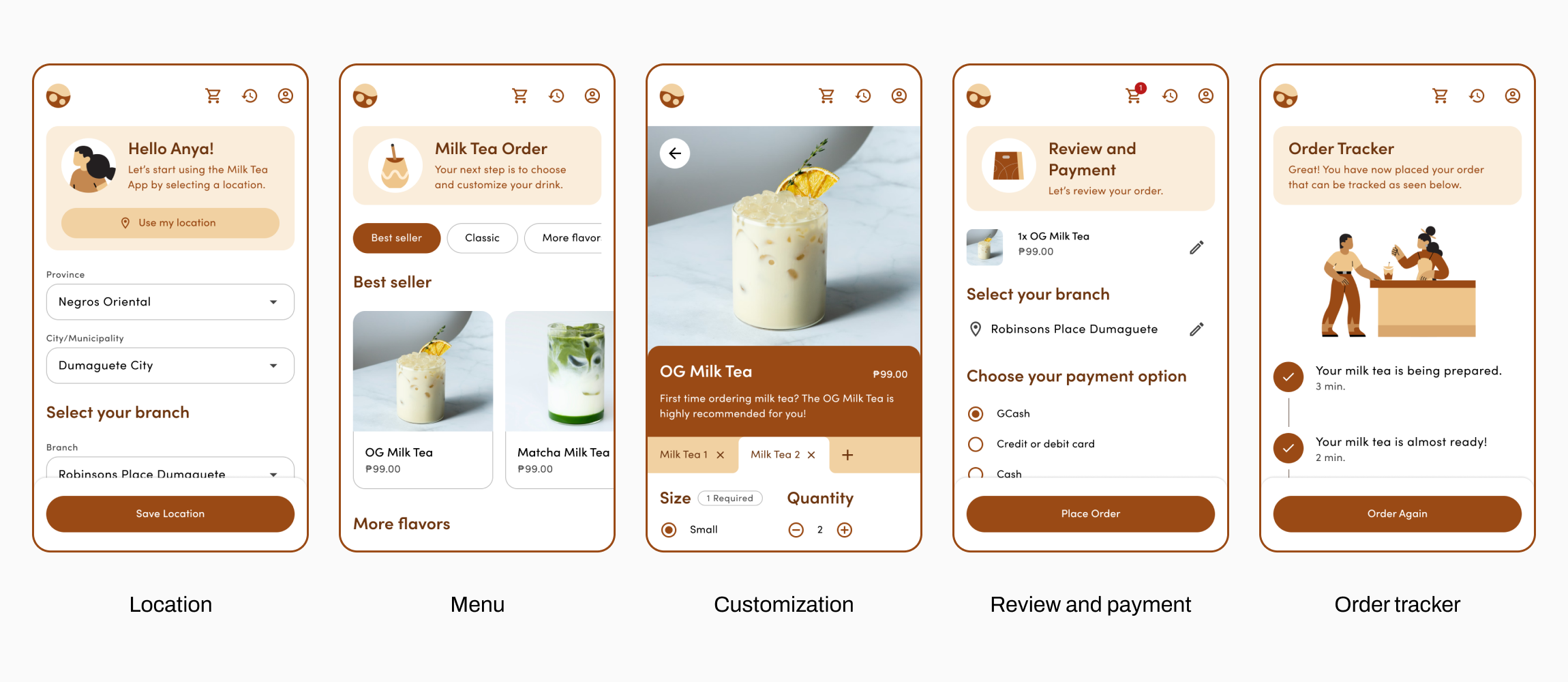
My proposed solution to reduce the user’s feeling of pressure from arriving customers would be a mobile application called the Milk Tea App. The application would allow users to take their time choosing a milk tea drink anytime, anywhere. Once the milk tea cafe staff has prepared the orders, the application will notify the user that the orders are ready for pick-up at their selected branch.
I categorized the flavors based on the common flavors my interview participants would order to make the milk tea menu less overwhelming. Some of the most ordered flavors belonged to the Best Seller and Classic categories. In addition, a Customization page was designed with tabs for users to order more than one drink of the same flavor but with different customization options.
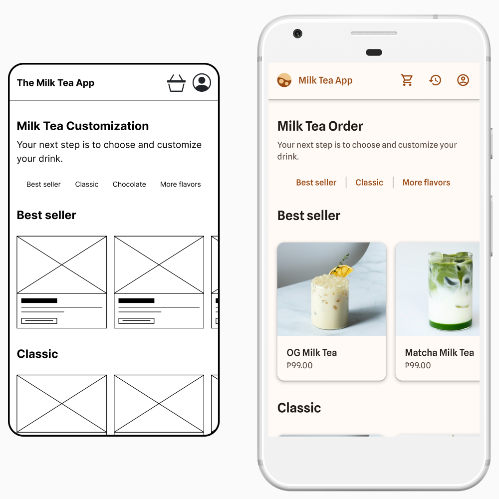
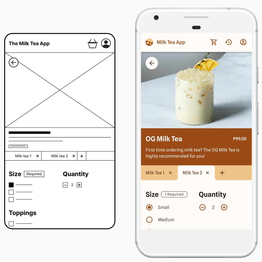
First Usability Test
I moderated a usability test for the user to evaluate the solution. As the moderator, I can clarify user responses on the spot. After conducting the usability test and gathering their responses, I created an affinity diagram. Based on the diagram, I learned that the Order History button, Customization page, and Category navigation bar needed improvement.
The first component to improve on is the Order History button. 5 out of 5 participants interpreted the basket button as a way to access the Cart page rather than the Order History page. Thus, the basket icon did not best represent the Order History page.
The next item I would like to improve is the Customization page. 4 out of 5 participants raised issues about the page, such as difficulty clicking the buttons. Lastly, improving the design of the Category navigation bar was a must since 2 out of 5 participants expressed that the navigation bar did not look like it existed.
Aside from items needing improvement, there was feedback that helped me answer whether the proposed solution would help lessen the user’s feeling of pressure and overwhelmedness when ordering milk tea.
Did the solution lessen pressure when ordering milk tea? None of the participants exhibited or mentioned feeling pressured when ordering milk tea using the mobile application. In addition, a participant commented that people would have to stand to wait for their orders at milk tea stalls. However, if there was an app like the Milk Tea App, people could track if their milk tea was ready.
Did the solution lessen overwhelmedness when ordering milk tea? There was no feedback of any difficulty when scrolling through the menu. One of the participants mentioned:
"I like that the best seller is located at the top. Definitely, that's a need, especially for new customers who do not know what to order."
As for the Customization page, I never asked my participants whether its design was better than the Customization page commonly seen in food delivery applications. However, a participant has stated:
"The tab's an interesting concept. I just feel like maybe it needs some more intuitiveness."
Improved Design
I improved the wireframes using Google’s Material Design system. Also, I have chosen brown and beige as the interface colors to resemble the color of a classic milk tea. Presented below are the changes made based on the previous usability test.
Order History Button and Category Navigation Bar
I changed the Order History icon from a basket to a clock, turning counterclockwise, as the latter best represents an Order History page. As for the Category navigation bar, there are dividers to make it look less like static text and more like a functional element.
Customization Page
The Customization page was improved by increasing touchpoint size, improving visual guides in the tab area, adding a prompt when removing a custom order, adding an option to write additional information, and utilizing radio buttons.
Second Usability Test
To summarize the results from the second moderated usability test, I have resolved the issues covered in the first usability test. However, a minor suggestion was raised, particularly for the Order Tracker page.
One participant suggested lightening the text for completed tasks to better distinguish between completed and current tasks. However, I changed the color and font weight of the current task for better accessibility.
The latest prototype of the Milk Tea App is accessible here.
Learnings
To wrap up the case study, I would like to enumerate what I have learned:
- Based on the user feedback, the mobile application may help lessen the user’s feeling of pressure and overwhelmedness when ordering milk tea.
- Fixing the issue from the second usability test and having more participants test the application is recommended for future studies.
- Watching the interviews and taking notes is helpful in gaining information that is necessary to group recurring responses.
- Checking the tech tools before conducting interviews is a must. I learned this the hard way when my video recording software updated automatically during one of my interviews.
- Learning a new design system was fun as I could customize it to fit the Milk Tea App brand. Plus, it was faster to design wireframes with it!
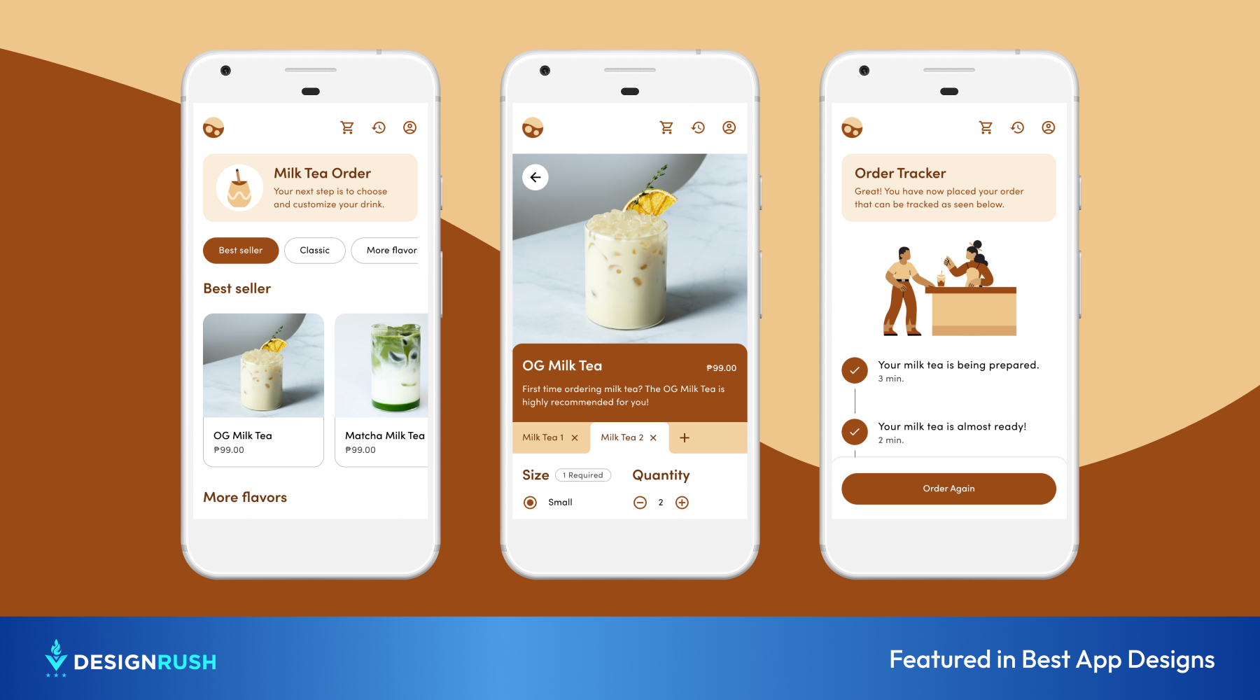
2023 Update
A year after completing the case study, I spent a weekend improving the Milk Tea App’s UI and UX. I improved the UI by adding illustrations to make the application more engaging. As for the UX, I made the call-to-action buttons sticky instead of placing them below a page. Designing mobile applications for work taught me that it is easier for users to look for the call-to-action button when it is sticking. Lastly, I made the categories in the Category navigation bar look more recognizable by designing it like a button. I have yet to have the new design tested to see if the user experience has improved.
Reference
Cabuenas, J. V. D. (2020, August 25). Shakey's to bring R&B milk tea to the Philippines. GMA News Online. https://www.gmanetwork.com/news/money/companies/752776/shakey-s-to-bring-r-amp-b-milk-tea-to-the-philippines/story/