Topic Bits
Timeline
July 2022 (1 Week)Role
UI/UX DesignerTools
Figma and Carbon DesignProblem
Microlearning has gained significant traction since 2015 (Leong et al., 2020). It has proven to educate healthcare professionals on a particular topic more effectively than traditional teaching methods (Fagerstrøm et al., 2017). Aside from its advantages in the medical field, microlearning shows promise in linguistics when utilized through a mobile application (Dingler et al., 2017).
After exploring more about microlearning, I realized there is little research on microlearning for a specific type of learner. I thought it would be interesting to learn more about microlearning tailored to learner types, such as auditory, visual, or kinesthetic learners. In this case study, I plan to explore how visual learners acquire knowledge better and design a microlearning application based on these findings.
Lastly, I was curious about how a design sprint works, so I kept the project timeline within a week.
Insights
I conducted one-on-one interviews with four visual learners aged 18-60 to discuss what makes them learn better. I gathered the data through one-on-one interviews to grasp insights directly from the participants. In addition, I based the age on a research paper by Fagerstrøm et al. (2017), as the authors used the same age range when recruiting participants to test their microlearning application. After completing the interviews, I rewatched the interviews while taking down notes. Based on the notes, I grouped similar sentiments and found two common responses on what makes visual learners learn better.
Conciseness
2 out of 4 participants expressed how they learn better when the information is concise. As stated by one of the participants, the concise information must fully explain the lesson. Also, another participant shared that they shun learning materials containing too much text.
Repetition
2 out of 4 participants utilize repetition when learning. The first step to repetition is mastering the first part of the lesson. Once learners have mastered the first part of the lesson, they move on to the next part they can master.
Solution
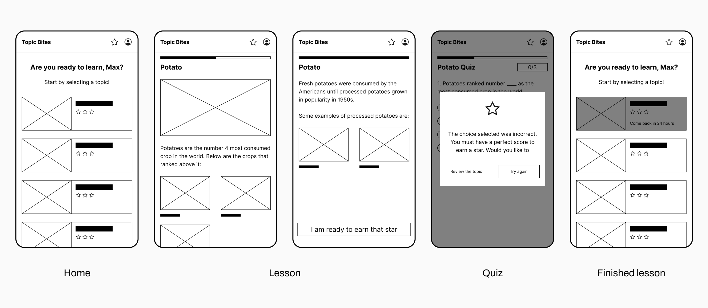
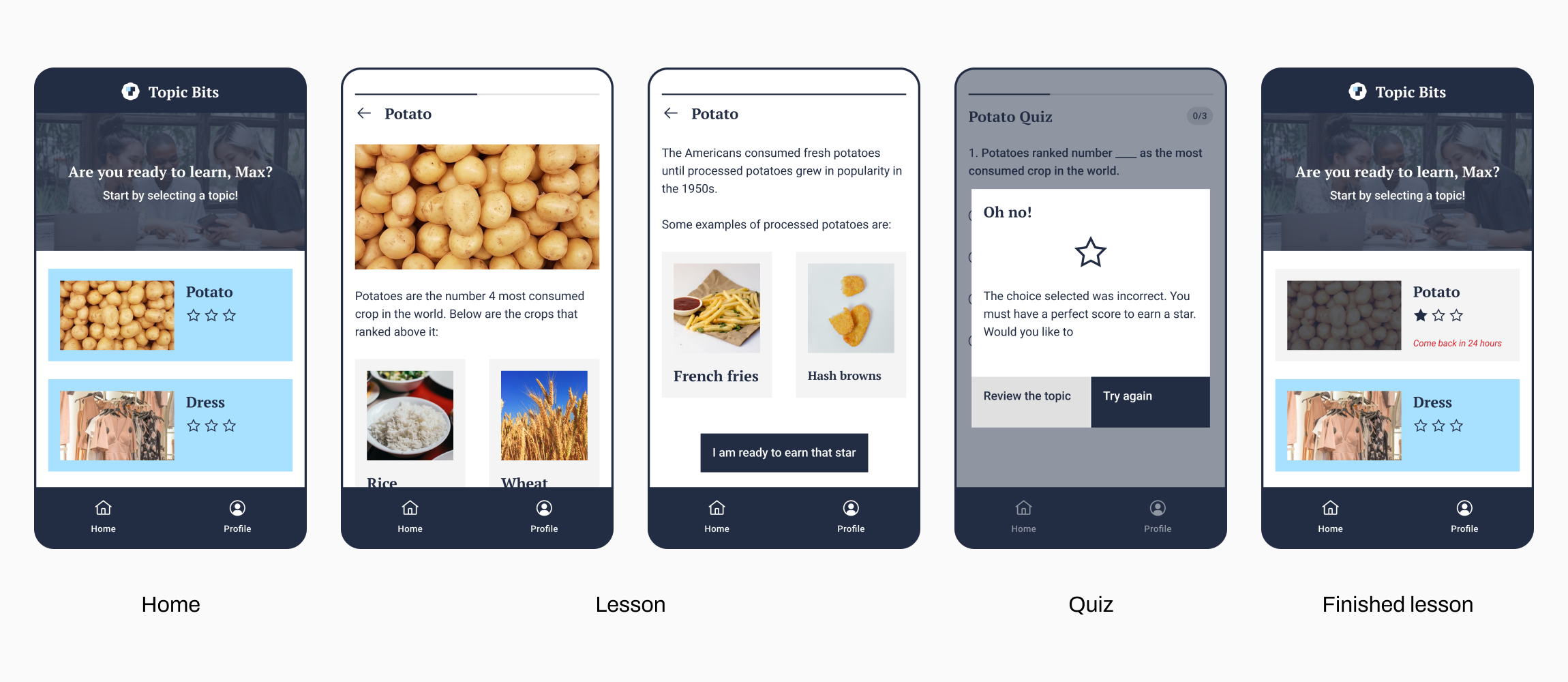
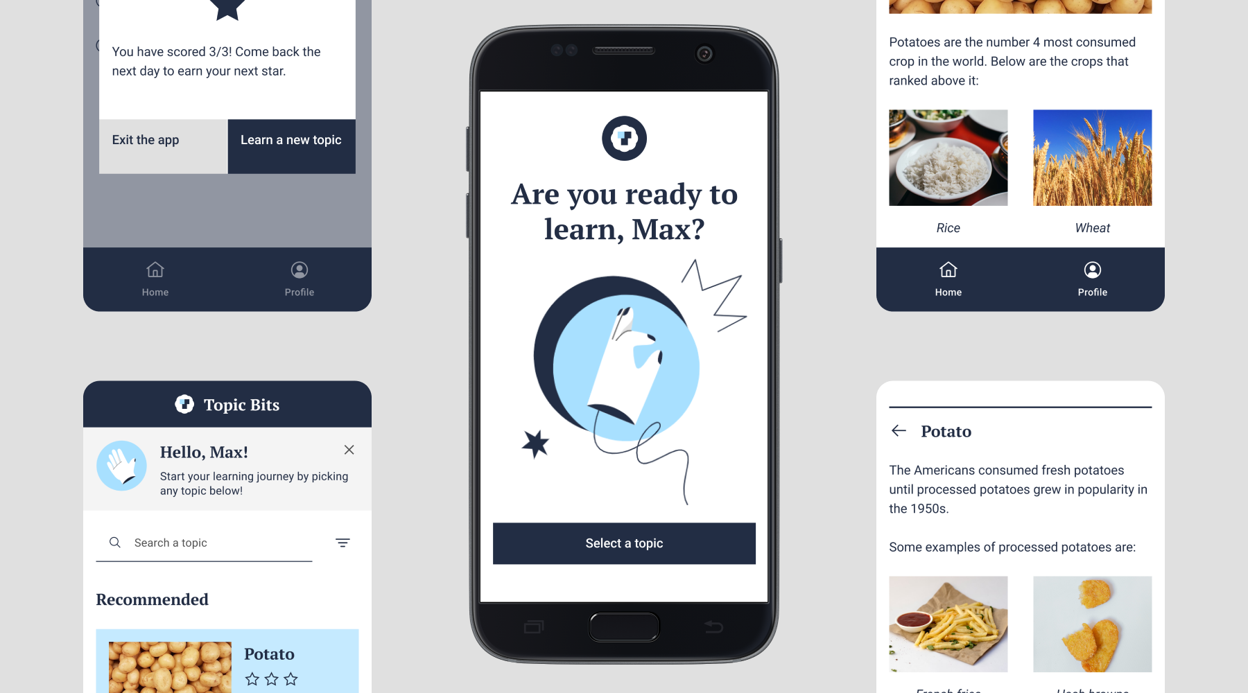
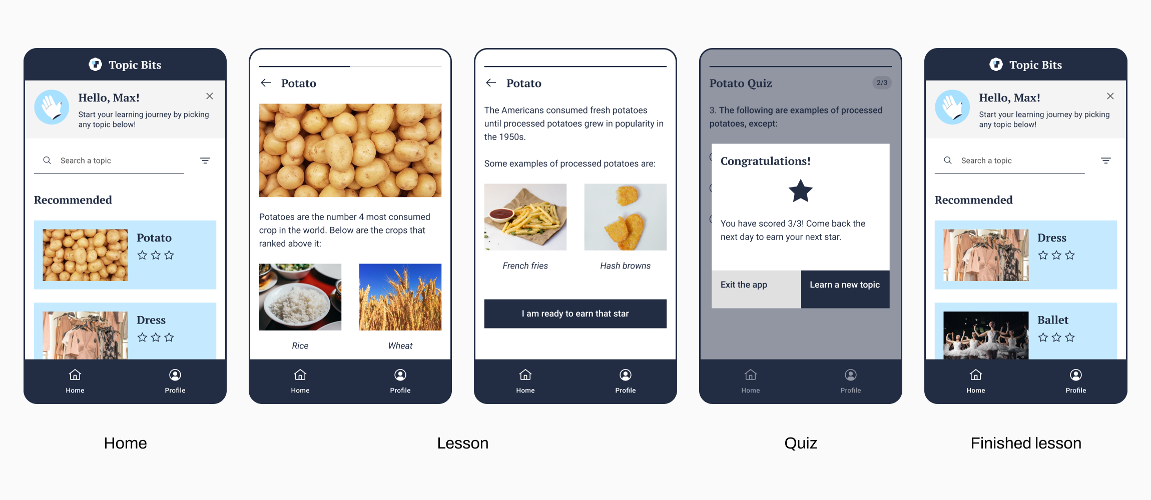
Topic Bits is a microlearning application that can cater to the learning needs of visual learners. The learner selects a topic from the Home page and then proceeds to the Lesson page. Next, the learner reads a part of a lesson before taking a quiz, which is where I applied conciseness when designing the application. When taking the quiz, the learner has to get a perfect score to access the next lesson, which is where I incorporated repetition in the design.
When designing the UI, I utilized the design system Carbon Design by IBM for faster design work. Moreover, I chose blue as the brand color since learners recall the lesson better when blue is used for visual presentations (Kumi et al., 2013).
Usability Test
I conducted a moderated usability test to evaluate my prototype and to ask for clarification on their responses in real time. Once I had completed my five usability tests, I took notes while rewatching the tests. After reviewing my notes, I listed the common concerns I could fix immediately:
- It was difficult to search for specific topics on the Home page
- The header on the Home page was not visible enough
- The image cards on the Lesson page appear interactive, but they are not
- There was no opportunity to change the answer before proceeding to the next question on the Quiz page
- It was challenging to identify finished and unfinished topics on the Finished Lesson page
- Learners mistook the stars in the Lesson’s card as a rating or difficulty level, which was supposed to represent the learner’s mastery level
- Also, there were no explanations shown when the answer was incorrect
- There was no flexibility on how long the learner could take the next test on the Finished Lesson page
Was Topic Bits concise? The participants did not mention that the Lesson page had too much information. Did Topic Bits successfully utilize repetition for better learning? Unfortunately, there were pressure-related responses from 3 out of 5 participants when they found out they needed a perfect score to move on to the next lesson. Here are the statements from the participants:
“Oh no, what if I get it wrong?”
“Oh wow, perfect, really?”
“Wow, pressure.”
In the future, I need to redesign the repetition aspect of Topic Bits so that it does not pressure the learner. It is essential to create a solution that does not make learners feel pressured but encourages them in their learning journey.
Improved Design
Improving the design was done separately from the one-week timeline. I found some time to improve the wireframes based on the “immediate fixes” I listed earlier. The prototype of the improved design is accessible through this link.
Home Page
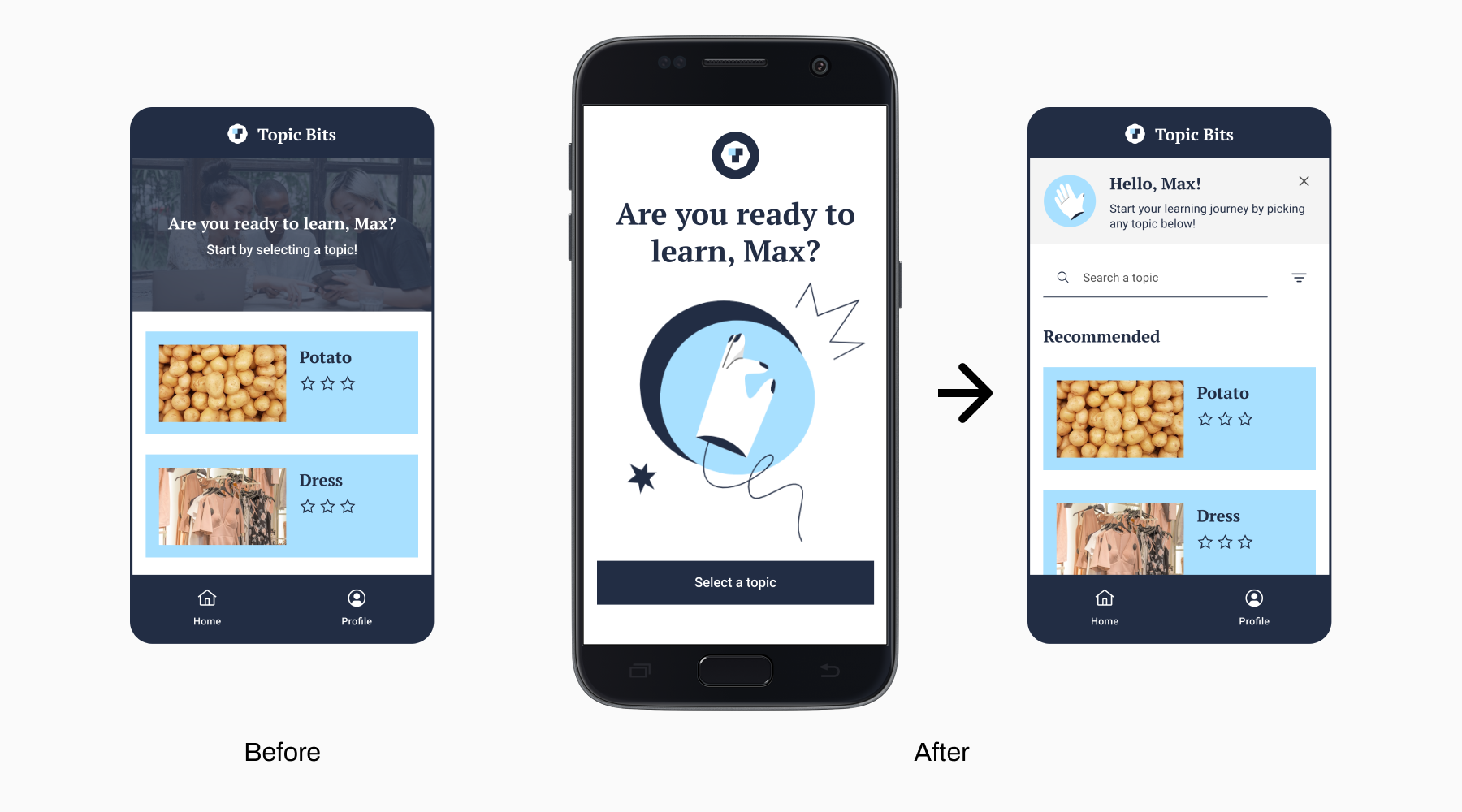
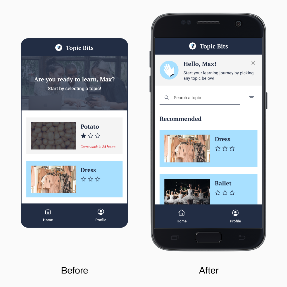
The first improvement I made is on the Home page. First, I added a search bar and a filter to make the topics searchable and categorized. If the learner did not use the search bar or the filter, the only category shown would be the Recommended category.
A participant suggested making the header fill the whole page so the learner would notice it. Instead of making the header take up the entire screen on the Home page, I decided to give it a separate page, the Landing page, to better distinguish the page for welcoming the learner and searching for topics.
Lesson Page
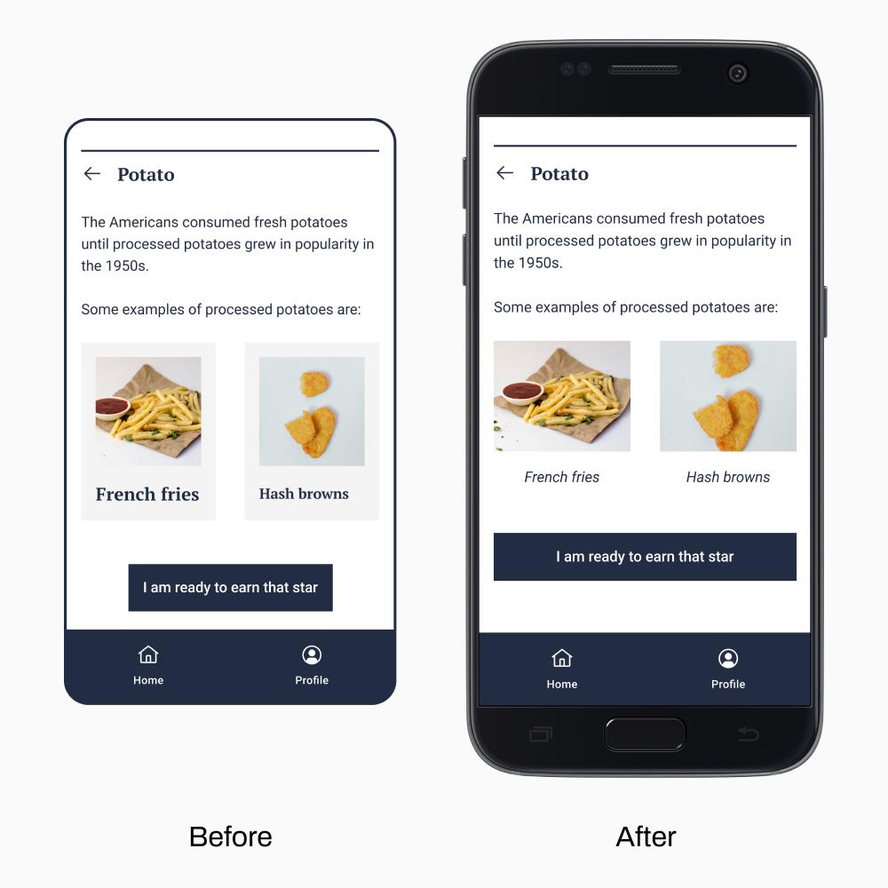
The concern raised on the Lesson page was that the image cards looked like buttons. I attempted not to make it look like a button by removing the background color. I also changed the font style to italic to make the text look like a caption.
Quiz Page
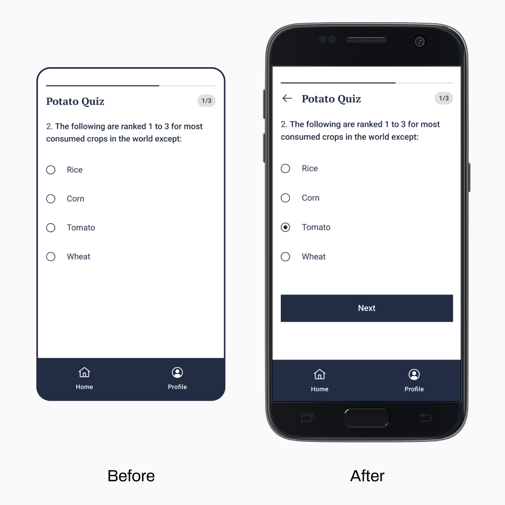
In the previous prototype, clicking the answer on the Quiz page displayed the following screen. Hence, the learner could not change their answer to the previous question. In the new prototype, learners can finalize their answers by clicking the Next button. They can also return to the previous question by clicking the Back button.
Finished Lesson Page
I removed the finished topic since learners will only interact with it the next day. I believe there are better ways to separate the unfinished and finished topics, but removing the finished topic is the only fix I can think of for now.
Recommendations
As I reached the end of the case study, here are the steps I would take to improve Topic Bits:
- A solution I can explore to lessen the pressure brought by the Quiz page is adjusting the passing score. By reading more papers on the optimal passing score, I can identify what passing score to set to make the learners master their lessons pressure-free.
- Discover more solutions to make the learners feel less pressured when taking the quiz.
- Apply the fixes under the “fixes for the future” list, such as allowing the learner to choose how long to take the next test on the Finished Lesson page.
- Conduct another usability test to evaluate user satisfaction based on the improvements.
2023 Update
I have made a super quick tweak to Topic Bits’ UI a year after its creation. I decided to lighten the sky blue color of the Lesson cards because I realized that the original sky blue color looked a bit too saturated. Furthermore, I would like to have the previous and current colors compared by participants to see which they prefer.
References
Dingler, T., Weber, D., Pielot, M., Cooper, J., Chang, C., & Henze, N. (2017). Language learning on-the-go: Opportune moments and design of mobile microlearning sessions. Proceedings of the 19th International Conference on Human-Computer Interaction with Mobile Devices and Services, Article 28. https://doi.org/10.1145/3098279.3098565
Fagerstrøm, A., Gulliksen, M., & Grønli, T. (2017). Microlearning in educating healthcare professionals. Proceedings of The 2017 International Conference on Advanced Technologies Enhancing Education (ICAT2E 2017), 31-34. https://doi.org/10.2991/icat2e-17.2016.8
Kumi, R., Conway, C. M., Limayem, M., & Goyal, S. (2013). Learning in color: How color and affect influence learning outcomes. IEEE Transactions on Professional Communication, 56(1), 2–15. https://doi.org/10.1109/TPC.2012.2208390
Leong, K., Sung, A., Au, D., & Blanchard, C. (2020). A review of the trend of microlearning. Journal of Work-Applied Management, 13(1), 88–102. https://doi.org/10.1108/jwam-10-2020-0044